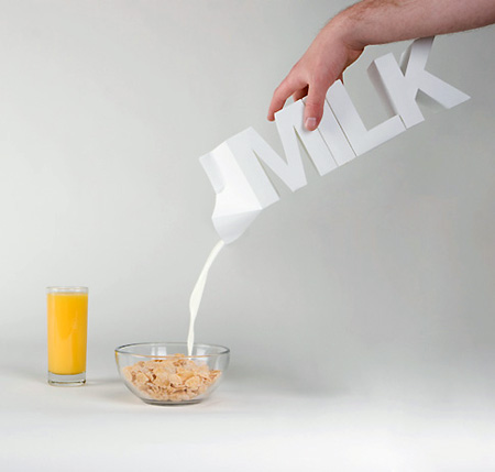
Given milk’s association with boring packaging, this creative design, consisting of letters, is a nice and refreshing change. However, we’d like to see a side view to see just how efficient the design really is — mainly the width.
[via Visualdevice – Toxel]
Given milk’s association with boring packaging, this creative design, consisting of letters, is a nice and refreshing change. However, we’d like to see a side view to see just how efficient the design really is — mainly the width.
[via Visualdevice – Toxel]