Graphic designer Will Paterson wanted to see how some modern logos would look in classic 1980s design styles, like IKEA and Netflix. During this time period, logos featured similar design elements, such as bigger font, bolder geometric shapes, and brighter color palettes, across various industries.
The 1980s was also when the digital age began, so logos became more geometric, with straight lines, squares, and other shapes. Other popular characteristics of logos during this time period include neon colors, chrome finishes, and 3D effects, indicating the emerging digital age. It’s safe to say that Apple was at the forefront of logo design, especially when the Macintosh was unveiled in 1984.
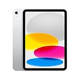
Apple iPad (10th Generation): with A14 Bionic chip, 10.9-inch Liquid Retina Display, 64GB, Wi-Fi 6, 12MP...
- WHY IPAD — Colorfully reimagined and more versatile than ever, iPad is great for the things you do every day. With an all-screen design, 10.9-inch...
- IPADOS + APPS — iPadOS makes iPad more productive, intuitive, and versatile. With iPadOS, run multiple apps at once, use Apple Pencil to write in...
- FAST WI-FI CONNECTIVITY — Wi-Fi 6 gives you fast access to your files, uploads, and downloads, and lets you seamlessly stream your favorite shows.